Back to Home
Back to Home
REGAIT Robot UI &UX Design
Overview
REGAIT is a rehabilitation robot providing training and evaluation solutions for patients with lower limb motor dysfunction caused by spinal cord injury, stroke, and muscle weakness.
As the sole UX & UI designer on the team, I led end-to-end design across research, prototyping, user testing, and final UI — collaborating closely with engineering, product, and executive stakeholders throughout development.
Users & Context
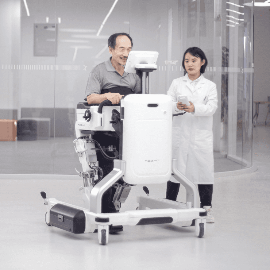
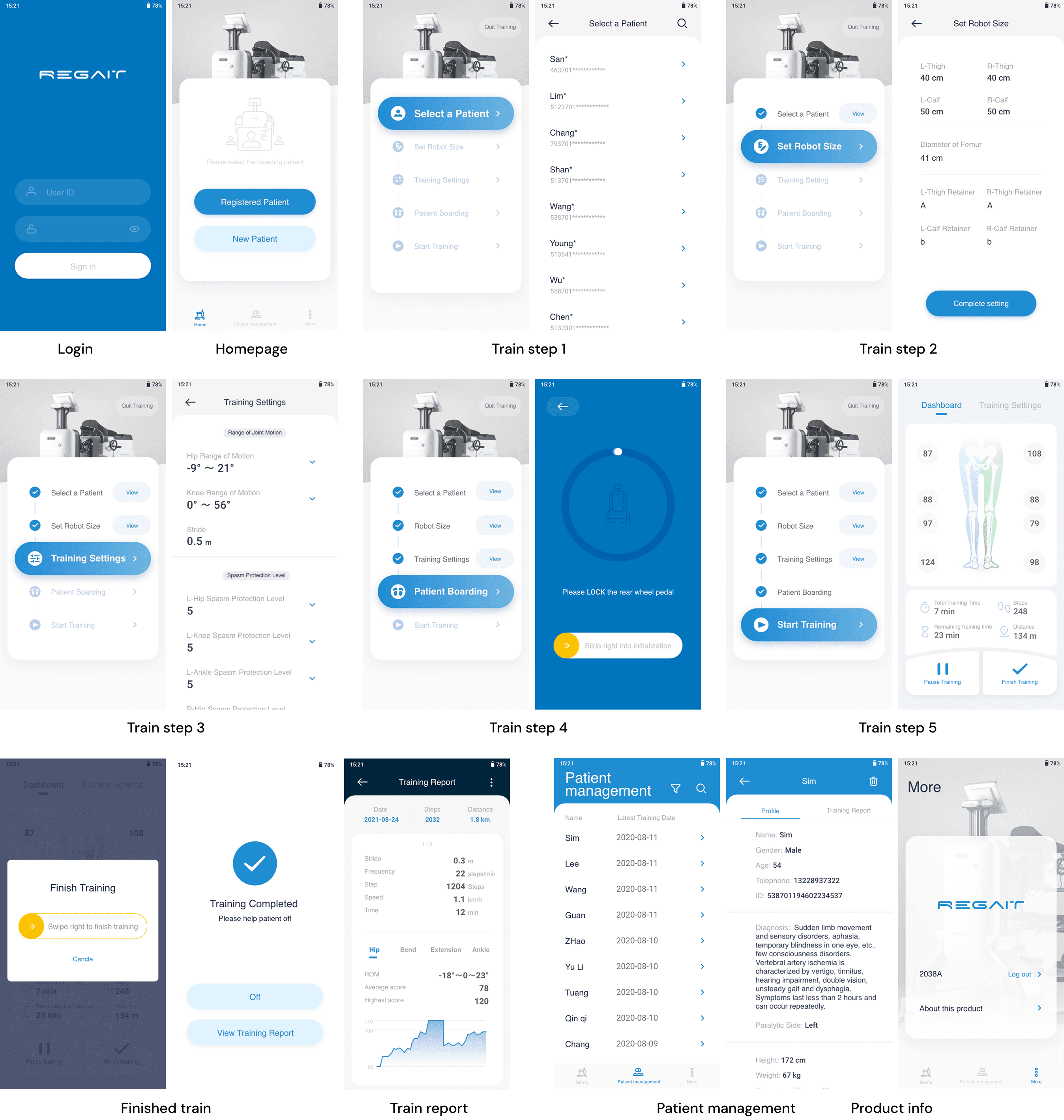
The interface served two simultaneous user groups: rehabilitation doctors and patients. Doctors work in hospital rehab departments, managing body measurement inputs and adjusting training parameters (joint angle, force) for each session. Patients are predominantly middle-aged stroke survivors experiencing partial or full loss of leg mobility.The product contains two interfaces — a Controller app operated by rehabilitation doctors, and a patient-facing tablet displaying real-time training scores.
My Role
Sole UX/UI Designer
Led all research, wireframing, prototyping, and final UI design, reporting directly to the Product Owner.
Doctor-facing app
The Challenge
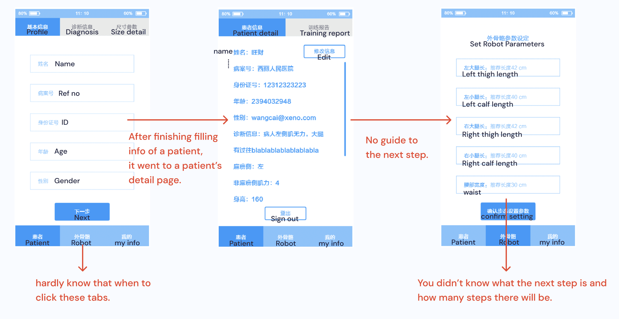
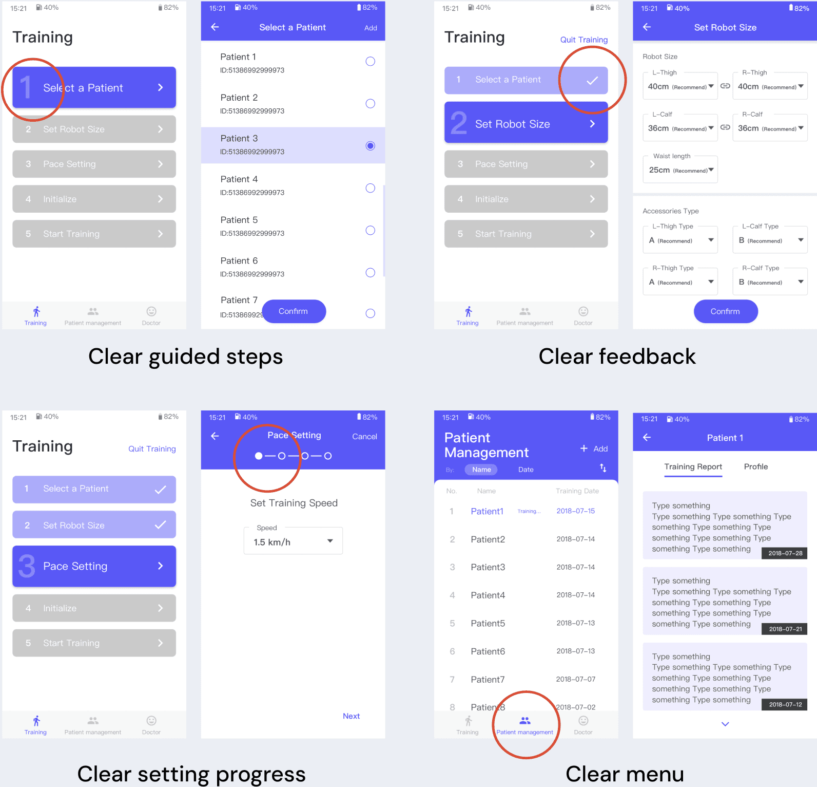
When I joined the project, an initial prototype had been produced by the industrial design team — functional in intent but not designed around clinical workflow. The interface presented doctors with a long, undifferentiated sequence of tasks, requiring constant context-switching between the app, the robot, and the patient. The result felt overwhelming rather than guiding.
Research
I began by researching the clinical environment and user needs. The primary user is the rehabilitation doctor, operating the device in a busy hospital setting with limited time per patient. This shaped my core principle: minimise the time and cognitive load required to complete a training session.
Design Principles
I established two foundations for this medical context.
First, clarity and simplicity — users should never have to think; the interface should guide them confidently through every step.
Second, safety awareness — critical information must be obvious, important actions must require confirmation, and system states must always be clear.
Key Insight
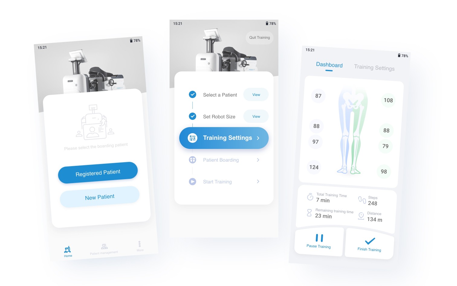
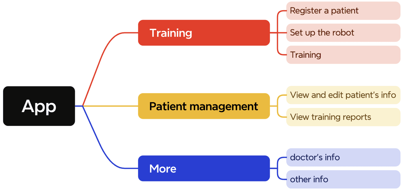
The original structure divided the app by roles, but doctors open the app with one goal: to train a patient. I reorganised the entire experience around this primary task, restructuring the app into three clear sections — Training, Patient Management, and More — so the most important workflow is always front and centre.
Solution
I designed a linear 5-step training flow — Select Patient → Set Robot Size → Set Training Details → Patient Boarding → Start Training — so users always know exactly where they are and what comes next.

Prototype
Before

After
Usability Testing
Iconducted task-based usability testing with 5 colleagues role-playing as clinicians. Participants were given patient profiles and asked to complete training prescription workflows using the prototype. Rated 5-step training flow and overall process on a 0–10 scale to identify friction points and prioritise design revisions.
Testing revealed that doctors were uncertain whether they had correctly entered patient information when moving into the robot configuration stage — but the original flow offered no way to review inputs without exiting the session entirely. This created anxiety at a critical point in the workflow. In response, I added an accessible patient data summary within the main training interface, allowing doctors to review and correct entries without interrupting the session flow.

Outcome
Final UI Design
The product passed Chinese National Medical Administration approval without modification — a rigorous regulatory standard for medical device software. This enabled a public launch ahead of stakeholder expectations, allowing the company to move quickly in China's competitive rehabilitation market. The product was also recognised with an IF Design Award and a Red Dot Award.
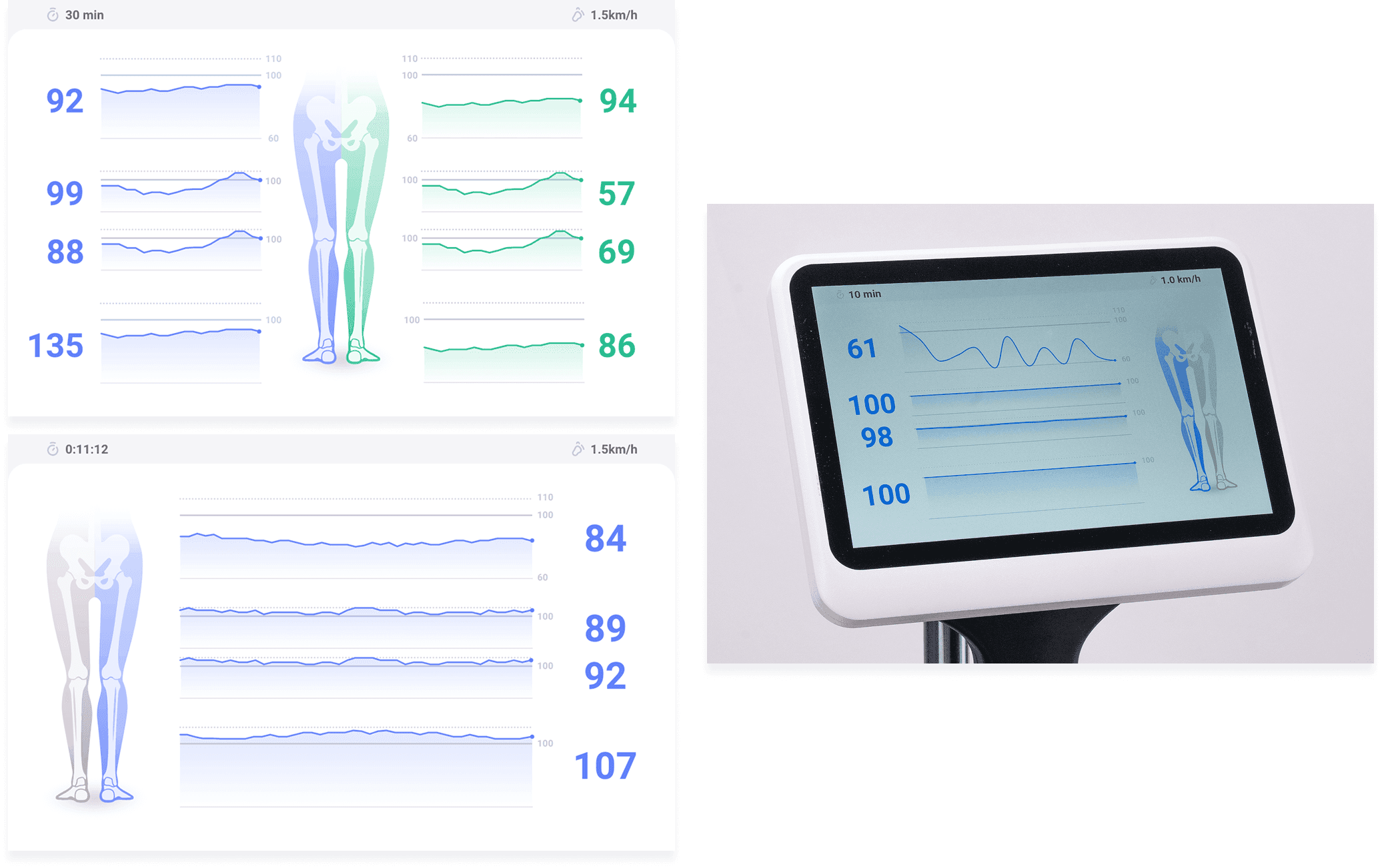
Patient-facing display
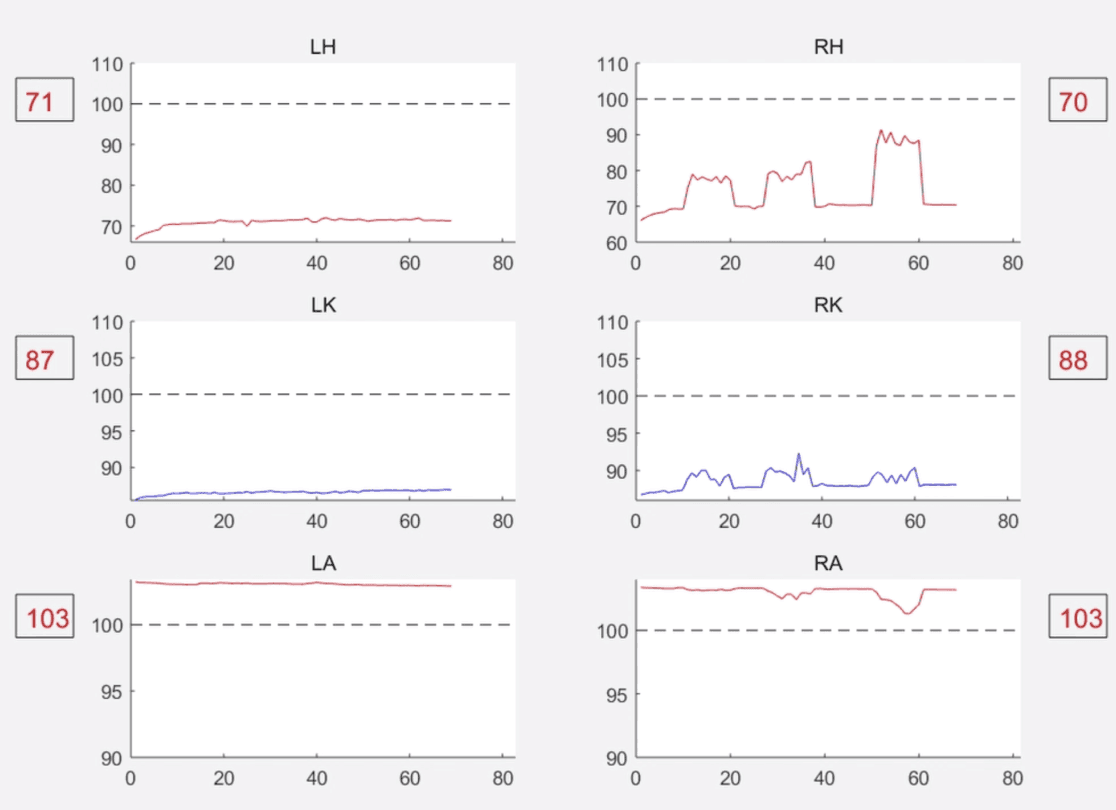
The patient-facing tablet was required to display real-time movement scores and curves across hip, knee, and ankle joints. The original requirement presented the data at clinical density — the same level of detail used by doctors.
Recognising that patients need to feel progress rather than analyse data, I stripped back the technical detail, removed axis labels and precise parameters, and redesigned the display around large-format scores, simplified curves, and a body diagram.
The goal was immediate emotional readability: a patient should be able to glance at the screen mid-session and understand how they are doing without any explanation.
Back to Home